
Do not fear the darkness. Instead, take a glowing shroom.
Certain organisms have a natural ability to create and display light, including but not limited to: fungi. This is called bioluminescence. Without going into too much of a science lesson: There are biological and chemical reactions that occur within the entity’s body. This chemical reaction results in what is commonly referred to as a “glow”
So how does this tie into my art?
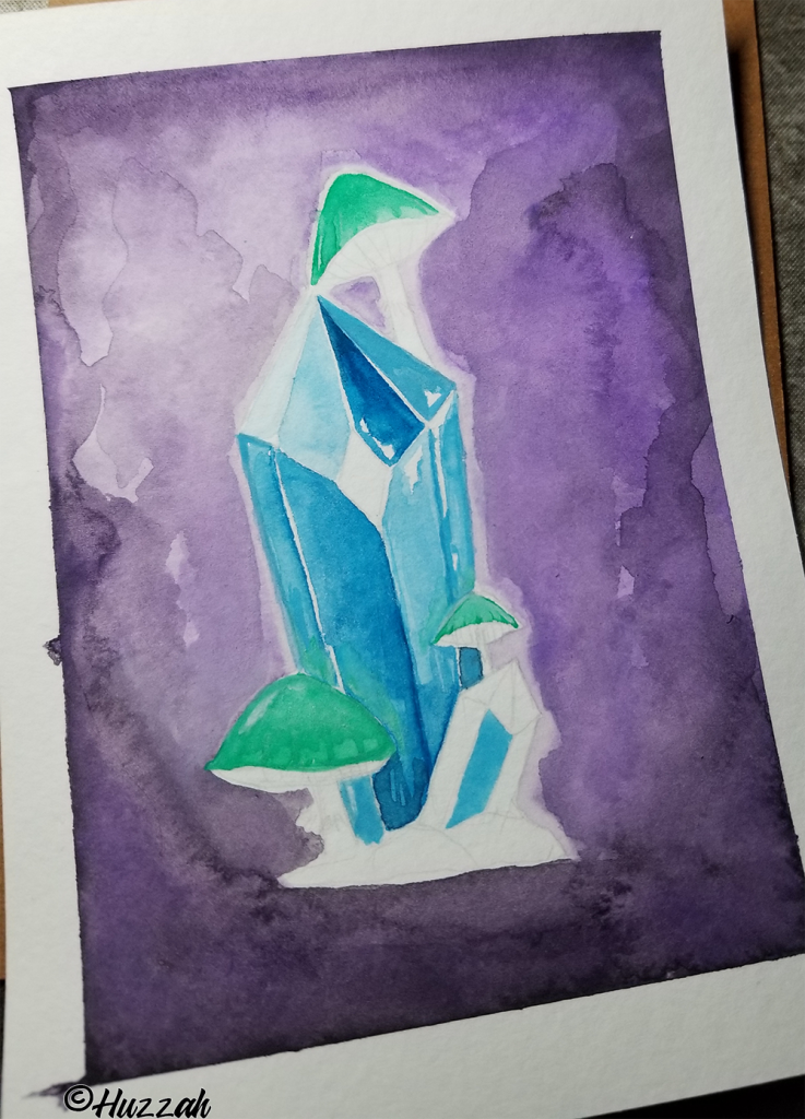
Weeeeell…I wanted to make a painting with a “glow” effect. I also clearly like to do things the hard way. Throwing together my sketch I knew it was also going to have my reoccurring theme of mushrooms and crystals. Can’t stop, won’t stop. Let’s see if I learned anything new! 🍄
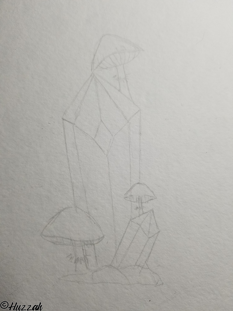
During the concept phase, I wanted the crystal to be a monolith, and these cute happy little shroomies of doomies would just be sprouting off of it. I also didn’t want the crystal to be an overwhelming force by having a bunch of pillars sprouting off it. The goal was to have them work together. Creating a symbiotic and natural display. Another conscious choice was the types of faces the crystal would have. I decided to go with a crystal with a facet that is commonly referred to as “a window“. It’s the perfect diamond in the top center of the main crystal.
Fun fact: Crystals of this type can be used in certain meditative practices. It’s believed they allow the user to open up windows to their inner self. Granting a higher level of introspection. While I don’t know about any of that, I do think it is incredible that these are naturally occurring formations.
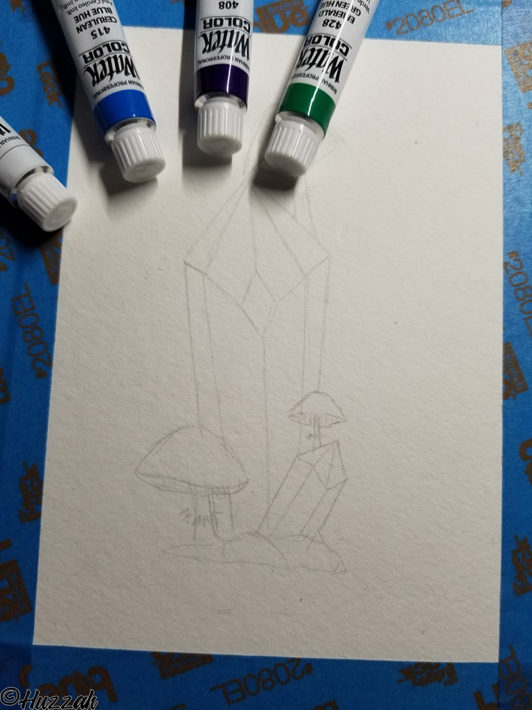
Going into this I only had one color in mind for the mushrooms. I wanted a vibrant almost noxious green. Like the poison apple from the animated Disney movie, Snow White. So I cherry-picked a few colors that I thought would have some synergy together right out the tube. I also figured I would worry about the semantics of shades and such later.
Now, I guess we are ready to paint.
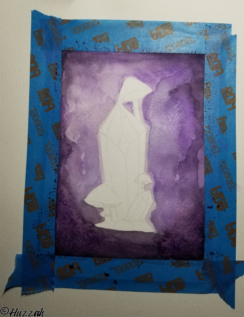
Golly, did I butcher the heck out of this wash. I was not happy about this part. Which was a shame because it really is such a lovely color- I just did **not ** do it justice. I did that technique where you take a clean brush with some water and run it over the page. After doing that then you start adding your color after the fact. Well, I think I used too much water. Or shouldn’t have used the water brush in this instance. You can actually see it in the picture, where the paper is so saturated with water in the bottom left corner.
I had planned it so that the wash would start dark around the edges and as it progressed to where the crystal was- it would be a lighter shade. Buuuuut, that’s not exactly how it worked out. So early on in the piece to already be in a headspace of not liking what is on the page. But alas, we persevere!
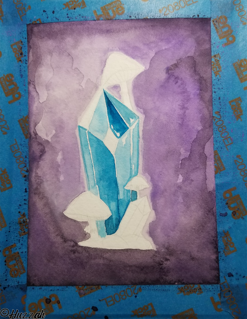
Progressing onto the crystal, I really wanted to make the blue a nice full color while also keeping in mind that I was going for a glowing aura appearance from the mushrooms. Which meant the green would be “reflecting” off the blue of the crystal. The result being that I went a little lighter in those areas while still trying attempting to be conscientious of lighting and shadows
~Tea Time ~
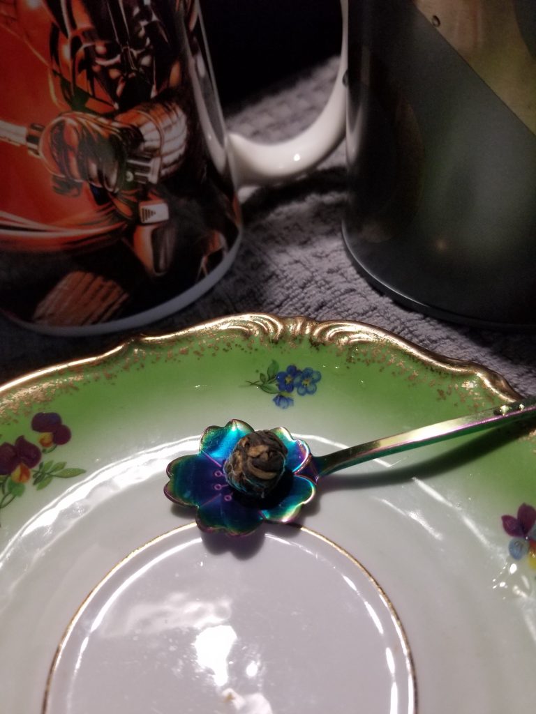
Took a small break to self-soothe with some delicious tea. Today’s cup was Black Dragon Pearls. Seeing this tea “pre-steep” you can probably see how it got its name. The tea is compacted into these little tea pearls that slowly expand once they hit the water. With this tea, I don’t like to add anything additional. It already has a deliciously smooth taste that I enjoy. I also usually get a second steep out of this tea, albeit expect a lighter flavor the second round.
I originally had plans to give these shrooms a ribbed aesthetic but silly me got a little overzealous causing paint to bleed into places I did not intend. As a result, it ruined my chances at that route but opened up some different opportunities. The bottom of the mushroom bells was still white and I felt like adding a little bit of contrast. Which I think worked out.
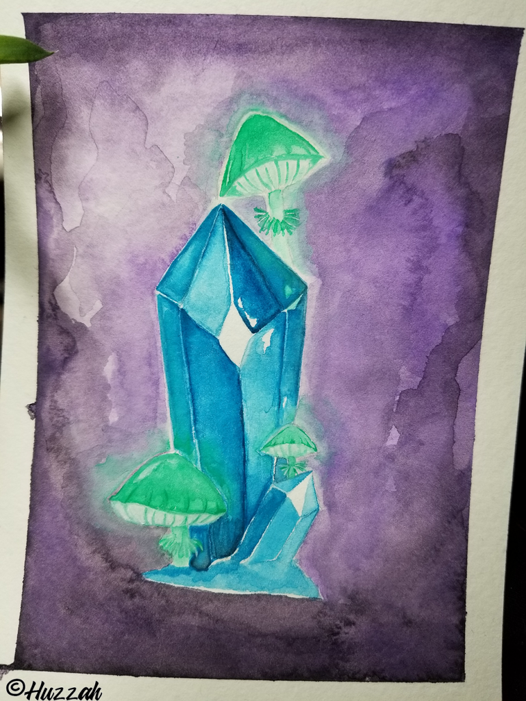
I think I could have benefited a little more from a combination of having more patience and consideration for the wash. Also, now that I really look at the finished product, I think it could benefit from using some darker colors of the green to help do some detail highlighting. I went into this with a certain level of confidence and swiftly had the medium remind me that I am forever learning.
This piece was great practice and I feel it still has more lessons to teach me. I am determined to do something with this hideous wash in the back. Maybe see if I can turn it into a more refined purple smoke look or something. So that will be something to work on. Practice modifying some mistakes into something beautiful perhaps…hopefully.
Let’s all ignore the tape that wasn’t evenly aligned! 🤣
Doodler Tools:
Pentel WaterBrush
ShinHan Water Color
Staedtler 2H Led
Special thanks to NyxLabs and all of the hard work being poured into it.

-Huzzah-


Get involved!
Thoughts